A classic musical about unrelenting honesty, love and dreams in a drought-stricken Texas town.
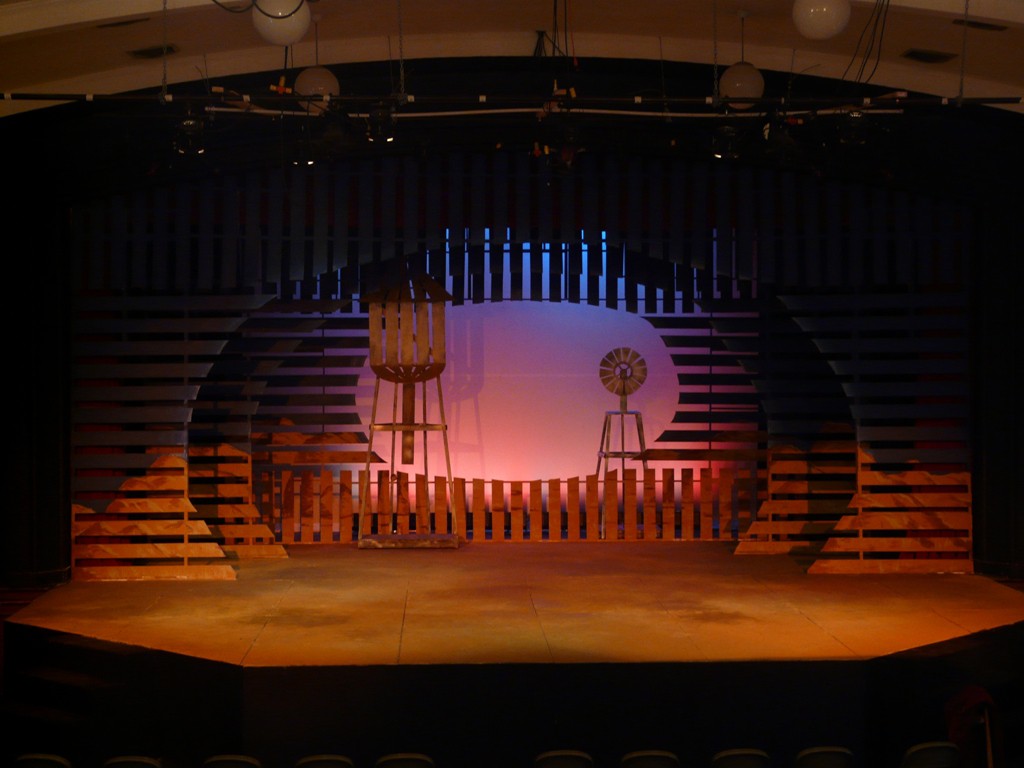
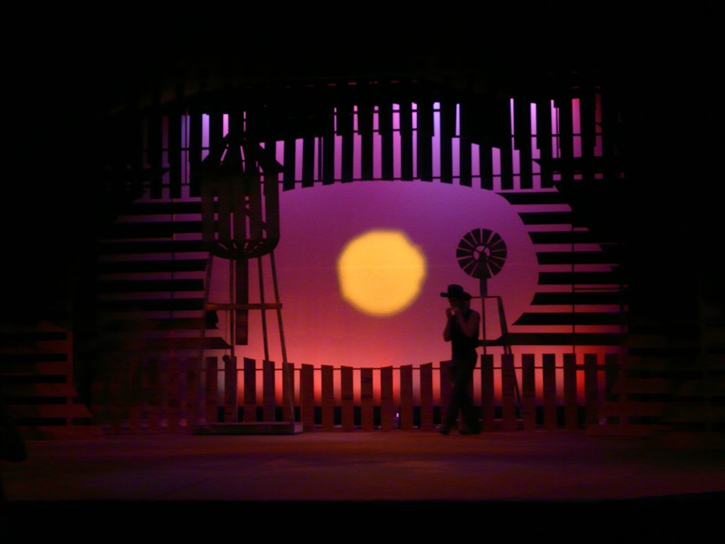
The design for 110 in the Shade began with the realization of the metaphor between Lizzie Curry’s harsh outlook and the drought. Once that connection was made, it was a simple matter to make everything about the sun. The lines were concentric circles about the sun. The dried boards functioned as a scrim while keeping the presence of the drought.The desert landscape painted on the slats grounded the show in reality. The best part about painting the set was the floor. It was made up of the remaining paint from the landscape. Pretty nifty and cost-effective.
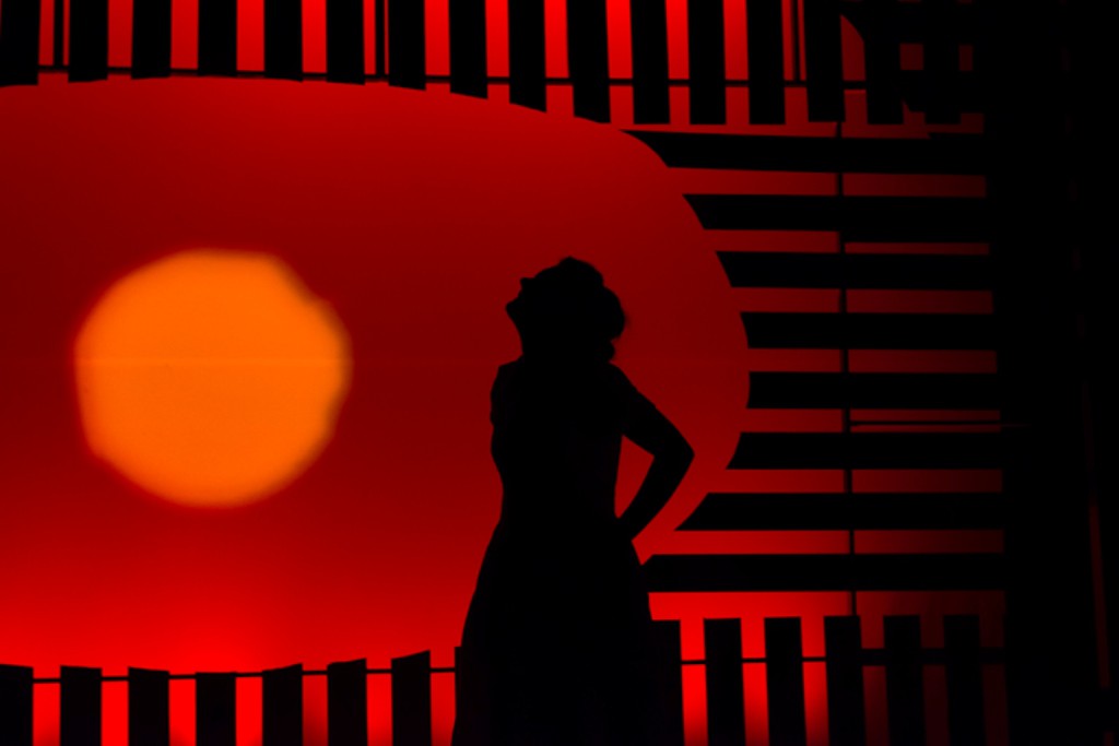
Director Robert Stoddard mentioned that for him, “Old Maid” was the core of the show. He vividly described this moving image that combines Lizzie with the hot, barren sun.
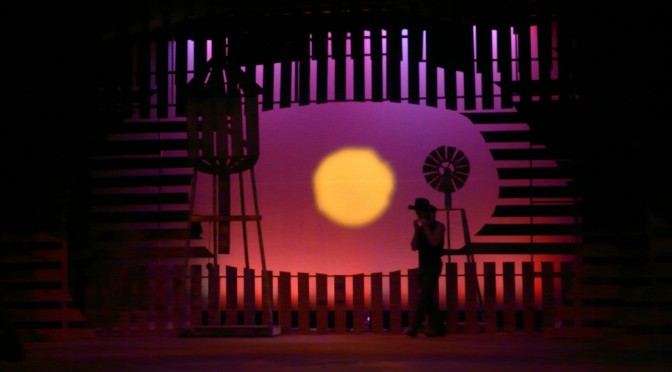
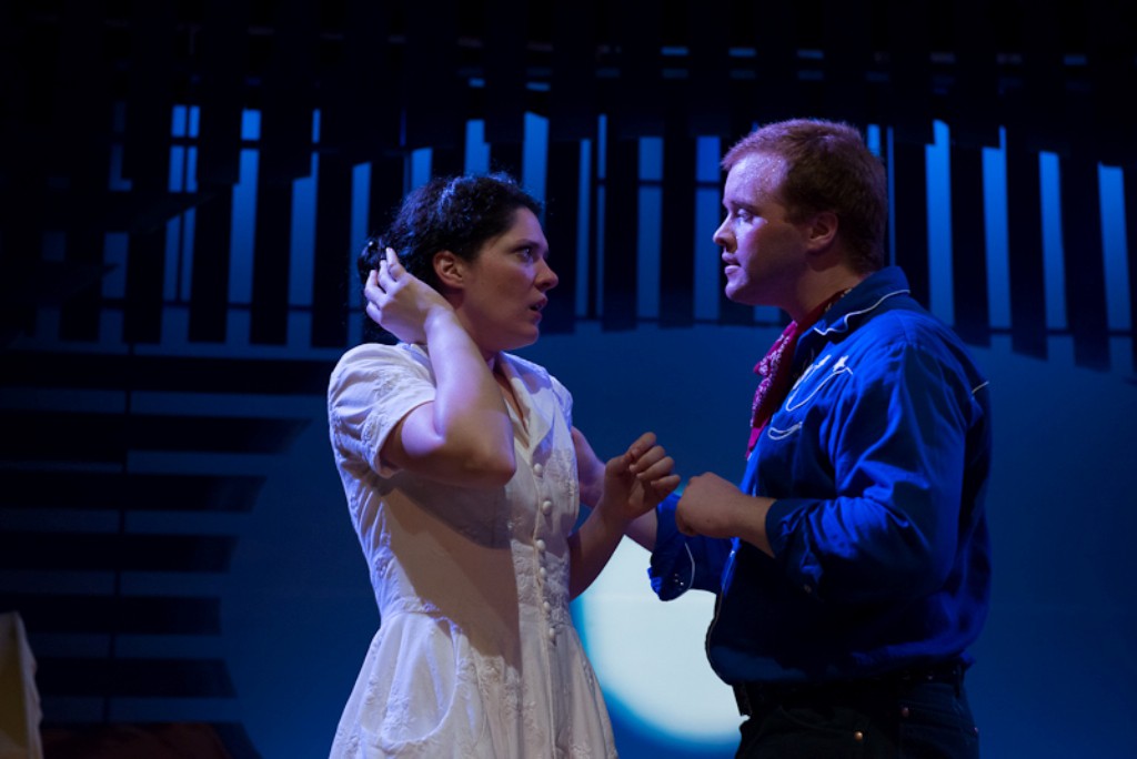
When Starbuck appears, it was important to soften the sun, but not forget about it. I used raw white and lavenders mixed with the amber to create a wonderful feeling scene full of energy.
A close up of the lavender during Lizzie and Starbuck at his gypsy wagon. The bright lavenders were such a relief after the amber day that I could get away with a lot more. The sun also turned into a full moon.
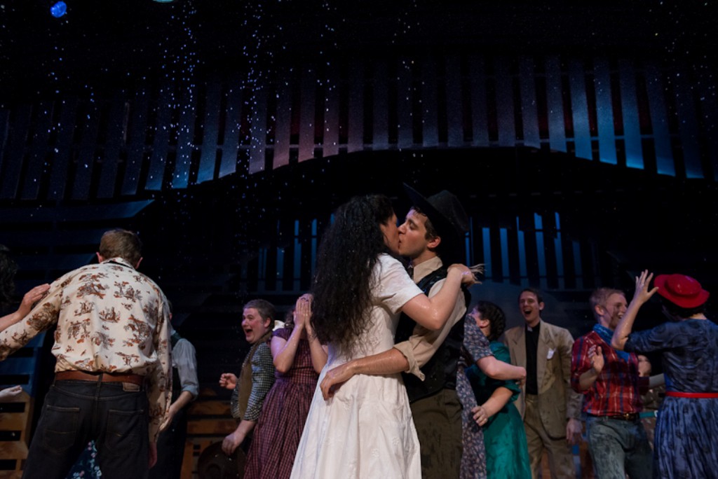
No production of 110 in the Shade would be complete without the rain.
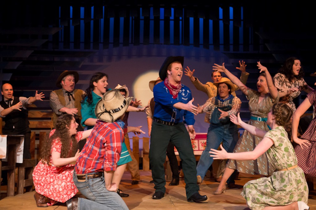
My favorite moment of the whole show is still at the beginning, when we see File and the townsfolk enter during the sunrise. It’s just beautiful.
